
Fitness equipment
Movement
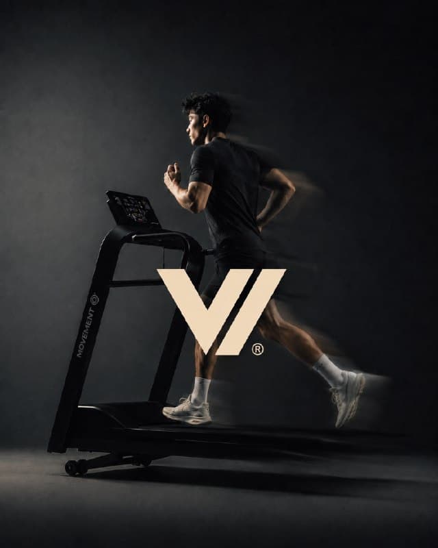
The hardest surface for a mark: a dark photograph with motion blur behind it. Two solid wedges, no thin strokes to disappear.
A logo is not a picture. It is one shape that has to stay itself at 12 millimetres and at three metres, in one colour and in full colour, on a photograph and on a box. This is how that shape gets made and what you receive.
Before a line is drawn: where will this live, at what smallest size, in how many colours, printed on what. A mark for a woven label and a mark for a facade are different problems, and the answer decides the drawing.
Three routes, drawn in black on white only. Colour is withheld on purpose — it flatters a weak shape, and at this stage the shape is the only thing being judged.
One route is taken forward. Curves, weights and spacing are corrected on a construction grid, then the mark is checked in the sizes it will actually meet.
Printed small, placed on photographs, reduced to one colour, put on dark and light. Anything that breaks here goes back to step three.
Vector source, a mono version, safe zone, minimum size, and the short document that says what may not be done to it.
Three marks, three different tests.
The hardest surface for a mark: a dark photograph with motion blur behind it. Two solid wedges, no thin strokes to disappear.
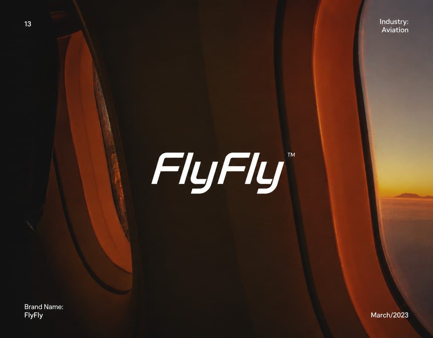
Placed over the brightest and the darkest part of one frame at once. The italic keeps its counters open at boarding-pass size.
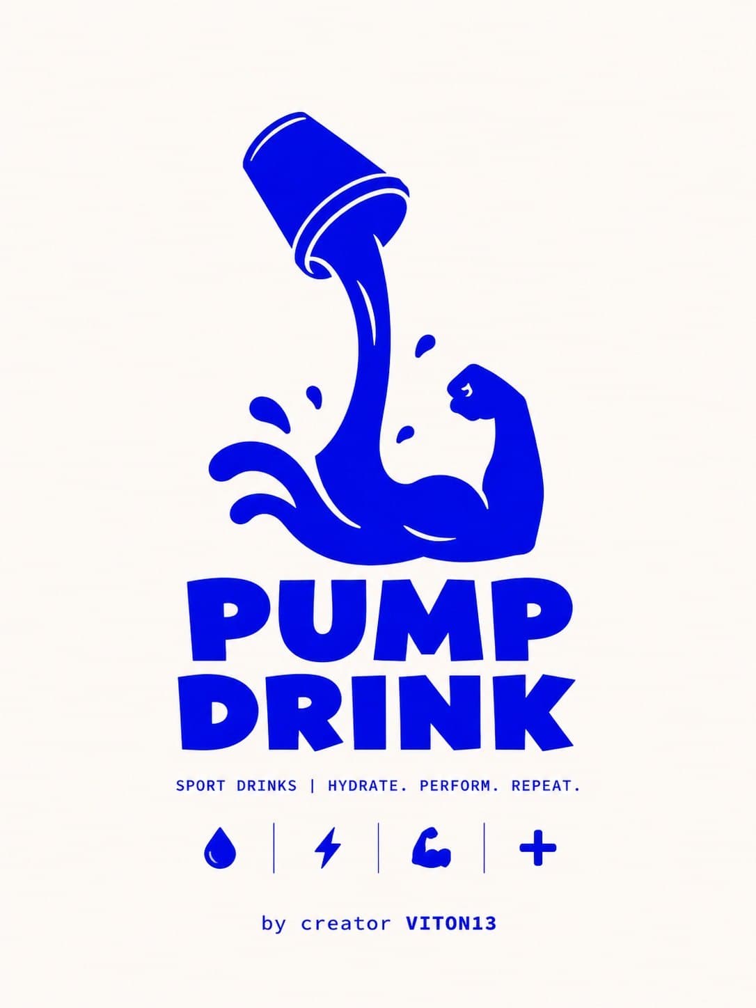
One flat colour on purpose. A bottle is printed, not rendered: one ink is cheaper per unit and cannot drift between suppliers.
Send the constraints — surfaces, smallest size, colours. If the honest answer is that you do not need this yet, we will say so.
Request a logo briefNeed the whole system, not one mark? Identity