Design / Identity

Brand identity

Identity is what happens after the logo: the palette, the type scale, the grid, the icons, and the rule for every surface the brand will touch. It exists so that work made next year by someone else still looks like you.

How a system is built

  1. 01

    Audit of surfaces

    We list every carrier the brand actually meets — screen, sign, package, garment, document — because the list decides how large the system has to be. A clinic and a drinks brand need different systems, not different colours.

  2. 02

    Core

    Logo, palette fixed to exact values, a type scale in the weights you will really use, and a construction grid. Fixed values matter: a colour described in words drifts between suppliers.

  3. 03

    Extensions

    Icons drawn at one stroke weight, layout rules, photography direction, and the interface if the brand lives on screens. Drawn together so they share a logic rather than being matched later.

  4. 04

    Application

    The system is applied to the real carriers from step one and corrected where it fails. This is where a palette that looked good on screen gets fixed for cotton.

  5. 05

    Guidelines

    One document a new supplier can follow without calling you: values, sizes, spacing, what is allowed and what is not.

What you receive

  • Logo system with all versions
  • Palette as fixed values, not descriptions
  • Type scale and hierarchy
  • Icon set on one stroke
  • Layout and application rules
  • Guidelines document
  • Rights assigned to you in the contract

Identity systems

Four systems. In each, the surfaces decided the design.

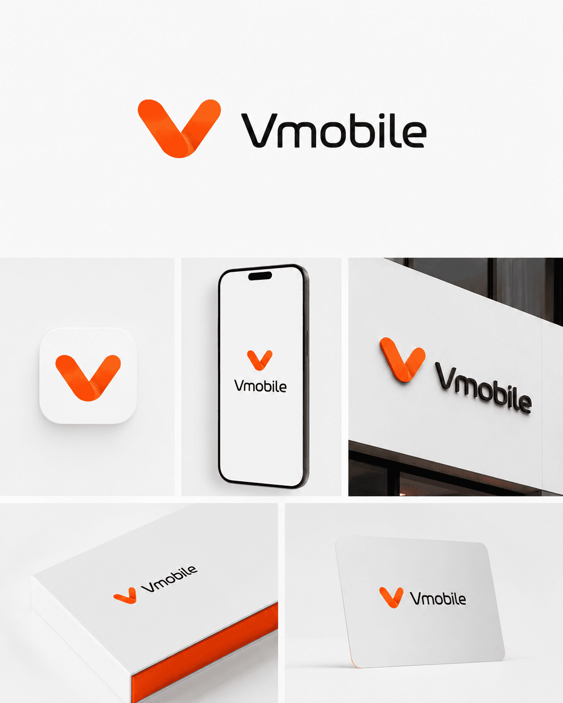
Vmobile — Mobile operator
Mobile operator

Vmobile

One mark that has to work as a 60-pixel app icon and as a three-metre sign on a facade. The V is drawn from two overlapping ribbons, so the shape stays readable when the gradient is flattened to a single colour for signage.

  • App icon
  • Phone screen
  • Facade sign
  • Packaging
  • Card
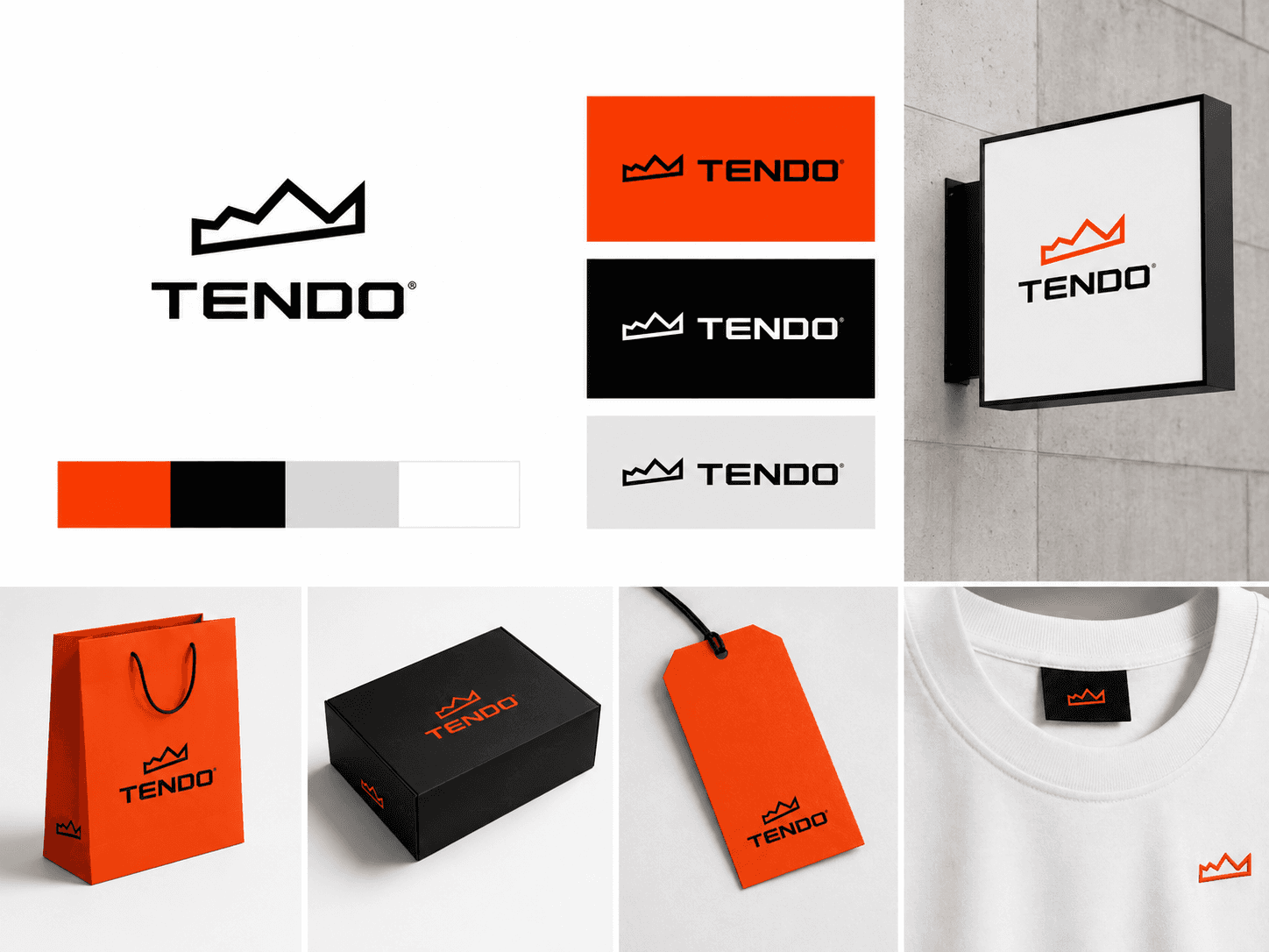
TENDO — Apparel
Apparel

TENDO

Built as a line, not a fill, so the same artwork works woven into a neck label at 12 mm and embossed on a box at 300 mm. The palette is fixed at four values because a garment brand prints on paper, card, cotton and film, and each substrate shifts colour differently.

  • Bag
  • Box
  • Hang tag
  • Neck label
  • Lightbox
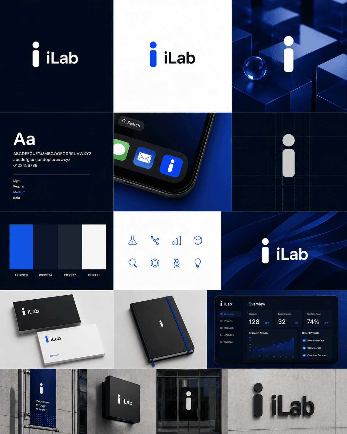
iLab — Research
Research

iLab

The full system rather than a mark: construction grid, four fixed hex values, a type scale in four weights, an icon set drawn on the same stroke, and the dashboard the icons actually live in. A research brand is read mostly on screens, so the interface was designed alongside the logo instead of after it.

  • App icon
  • Dashboard
  • Cards
  • Notebook
  • Facade
  • Banner
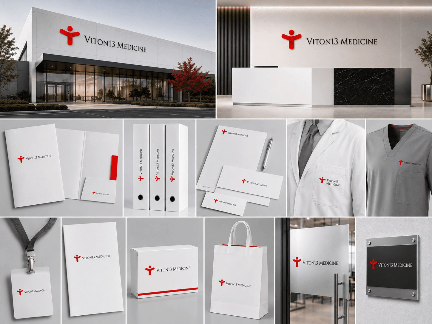
VITON13 Medicine — Healthcare
Healthcare

VITON13 Medicine

A clinical system, where the constraint is legibility under bad light and a lot of small print. One red against white and grey, a figure mark that reads at badge size, and every carrier a clinic actually uses: lanyard, folder, file spine, envelope, coat, scrubs, door plate.

  • Facade
  • Reception
  • Folder
  • File spine
  • Stationery
  • Coat
  • Scrubs
  • Badge
  • Door plate

Start with the surface list

Send the list of carriers your brand actually touches. It is the fastest way to a real estimate, and it is the first thing we would ask for anyway.

Request an identity brief

Only need the mark for now? Logo design