
Answer in brief
A small-site decision rule for turning heatmap patterns into hypotheses without confusing visual intensity, mixed sessions or large samples with proof.
There is no universal session threshold
A heatmap can be generated before it can support a reliable decision. Microsoft Clarity explicitly states that there is no minimum traffic limitation to generate a heatmap. That is a product capability statement, not a research threshold. Whether the map is useful depends on the question, the homogeneity of the visitors, the page state, the size of the observed pattern and the cost of acting on a false signal. A fixed session count ignores all five.
For a small website, use a decision rule instead of a magic number: collect relevant sessions until the important pattern repeats within the same task segment and remains visible when the observation window is split into separate batches. Use that pattern to generate a hypothesis. If the proposed change is costly, irreversible or commercially important, confirm it with additional behavioral evidence, usability research or an experiment before calling the heatmap proof.
This distinction answers the practical question more accurately than “wait for 1,000 sessions.” One hundred highly comparable sessions on one stable checkout step may reveal a repeated dead click worth investigating, while thousands of mixed mobile and desktop visits across changing layouts can produce a smooth-looking map that explains little. Sample size matters, but sample definition comes first.
Know what the colors actually summarize
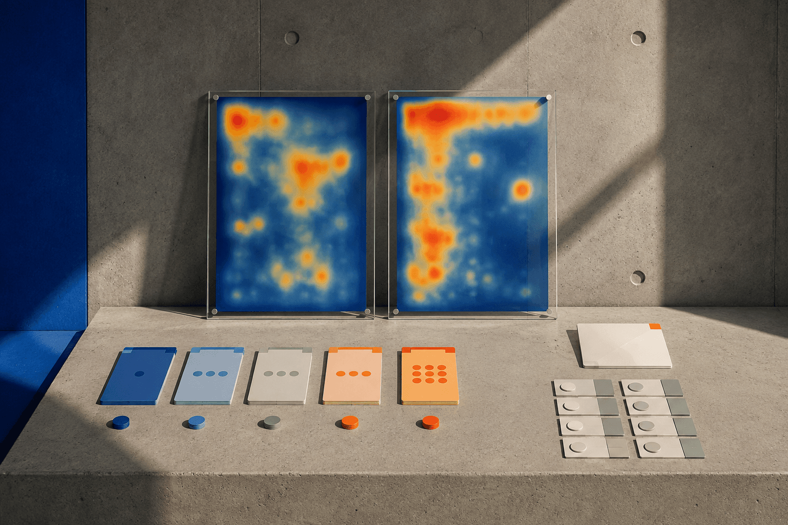
Heatmaps aggregate recorded interactions. Clarity provides click, scroll, area and other heatmap views, turning many individual events into a visual distribution. The result is useful for seeing where attention or interaction appears concentrated, which areas receive little reach, and where unexpected clicking occurs. It does not expose motivation. A bright cluster can mean interest, confusion, a larger target, a misleading visual cue or simply a common path through the task.
The visual smoothness creates a cognitive trap. Once dots become a gradient, the output looks more precise than the underlying behavior may be. Treat the map as a compression of event data, not an image of the user’s mind. Always return to counts, page state and recordings where available to understand what generated an apparent hotspot.
Scroll maps need the same caution. A drop in reach lower on the page can indicate abandonment, but it can also mean the user completed the task earlier, navigated away successfully, encountered a sticky interface or arrived through an anchor link. Ask what the page expects the visitor to do before treating depth as a quality score. The heatmap becomes meaningful only when it is attached to a task model.
Segment before deciding whether the sample is large
The fastest way to make a small sample useless is to mix unlike sessions. Separate mobile from desktop when the layout changes. Split new and returning users if their tasks differ. Distinguish traffic to a pricing page from people who arrive directly at a support section. Filter by country or language when content and viewport behavior differ. A single aggregate can create a hotspot that no real subgroup actually exhibits.
NN/g’s guidance on quantitative user research emphasizes choosing methods and samples in relation to the research question rather than applying one minimum across methods. Heatmaps are observational aggregates, so the relevant unit is not simply “sessions on the site.” It is sessions that experienced the same interface state while pursuing sufficiently similar tasks. That is the population about which the map can say something.
Write the segment on the chart title: “mobile visitors to product page A from non-brand search,” not “all traffic.” If the segment is too small to show a stable pattern, broaden it only when the combined users genuinely share the same design and job. Combining data to make the picture look fuller is not increased evidence if the underlying experiences are different.
Look for recurrence, not visual intensity alone
A useful small-site rule is recurrence across batches. Divide the relevant observation period into two or more non-overlapping windows and ask whether the same meaningful behavior appears each time. A cluster that exists only on one day may be campaign traffic, a temporary layout state or noise. A pattern that reappears after new visitors arrive is more credible as a design signal, even before any formal causal claim is made.
Recurrence should be behavioral, not pixel-perfect. Responsive layouts, browser dimensions and dynamic content can shift exact coordinates. Clarity documents limitations around dynamic page content and heatmap screenshots, so selectors and page state matter when interpreting where interactions land. Define the pattern semantically—“users repeatedly click the noninteractive product image” or “few mobile sessions reach delivery information”—rather than by a precise colored spot.
Then inspect magnitude in context. One accidental dead click is different from repeated attempts by many independent visitors. A popular navigation item will naturally be hotter than a secondary link. Compare the observed behavior with what the design intends. The useful signal is the gap between expected and repeated behavior, not merely the hottest area on the page.
Use heatmaps to generate hypotheses
Heatmaps are strongest at identifying where to investigate. If visitors repeatedly click a heading that is not interactive, hypothesize that its styling implies a link. If many sessions stop scrolling before an important shipping condition, hypothesize that the condition is too deep for the task. If users cluster around one comparison attribute, hypothesize that it carries more decision value than the page hierarchy gives it. Each statement should be testable with another method.
The next evidence can be qualitative. Watch session recordings around the pattern, run moderated or unmoderated usability tasks, examine support questions, or speak to recent customers. These methods can explain why behavior occurred. Analytics can add prevalence: does the page with the apparent problem also have an unusual exit, error or conversion pattern compared with similar pages? The goal is triangulation, not collecting multiple dashboards that repeat the same event.
Avoid writing conclusions into the observation. “Users are confused by the button” is not what a heatmap records. “Relevant mobile sessions repeatedly tap the label beside the button, which is noninteractive” is an observation. “The label appears actionable” is a hypothesis. “Making the whole row interactive improves task completion” is a testable prediction. Keeping those layers separate prevents small data from turning into confident psychology.
Match evidence strength to the cost of the decision
A low-risk, reversible fix can justify action with relatively modest evidence. If a noninteractive card repeatedly receives taps and making it clickable is consistent with the design system, the cost of trying the improvement may be small. Document the hypothesis, make the change, and monitor whether downstream behavior improves. Waiting for statistical certainty can be wasteful when the intervention is cheap and failure is easy to reverse.
A high-risk decision requires more. Removing a checkout field, changing pricing architecture, moving a regulated disclosure or redesigning primary navigation can affect revenue, compliance and many user groups. A heatmap pattern should trigger deeper research rather than serve as the final verdict. Use controlled experiments where suitable, task-based usability studies, form-error analytics or other measures that directly correspond to the decision.
This is the decision-theory part of the threshold. The amount of evidence required rises with the consequence of being wrong. A small website can therefore move quickly without pretending its sample is statistically conclusive: use weak evidence for low-cost hypothesis testing, and demand stronger confirmation as irreversibility, exposure or business impact increases.
Know when a larger sample still will not solve the problem
More sessions do not repair a badly defined question. If a page changes every week, a large aggregate can mix multiple designs. If personalization shows different modules to different audiences, a single heatmap can average incompatible experiences. If visitors arrive with several unrelated tasks, the common pattern may be meaningless. Before waiting for volume, decide whether the measurement can isolate the state and audience you care about.
Technical limitations can also distort interpretation. Dynamic elements may move, sticky components can overlap content, single-page applications can reuse routes, and consent or script blocking can reduce observed sessions. Clarity exposes filters and heatmap features that help narrow analysis, but the analyst still needs to confirm the recorded page corresponds to what users actually saw. A large dataset with systematic measurement error is not automatically more trustworthy.
Likewise, heatmaps cannot prove a counterfactual. They show behavior under the existing design. They do not tell you what the same users would have done under a redesigned version. For that, an experiment or comparative usability test is needed. The threshold question therefore ends where causal comparison begins: enough heatmap data can make a hypothesis credible, but no amount of one-version heatmap data proves the alternative is better.
Adopt a repeatable small-site decision rule
Use five gates. First, define one task and one interface state. Second, segment to visitors who genuinely experienced that state. Third, collect until the behavior of interest recurs across separate observation batches. Fourth, verify it with at least one independent source of evidence—recordings, analytics, support data or user research. Fifth, scale confirmation to the decision risk. If a gate fails, gather better evidence rather than simply accumulating more mixed sessions.
Record the decision in a short research note: segment, dates, sessions observed, page version, behavior, competing explanations, corroborating evidence, action and confidence level. This is especially important on small sites because a memorable cluster can otherwise become institutional folklore. A written note shows whether the change came from a repeated observation or from one visually dramatic screenshot.
The direct answer to “how many sessions?” is therefore conditional: enough relevant sessions for a pattern to recur under a stable design, but not a universal number that proves the conclusion. Heatmaps are hypothesis engines. Their value comes from disciplined segmentation and repeated behavior, while proof comes from methods that match the claim. Small websites do not need to wait for enterprise traffic; they need to stop asking small data to answer a bigger question than it can.
Practical checklist
- Define one page state, audience segment and task before opening the heatmap.
- Split the observation period and check whether the same behavior recurs.
- Inspect recordings or analytics around the apparent hotspot.
- Write the observation separately from the explanation you are hypothesizing.
- Match validation strength to the commercial or compliance risk of the change.
- Document the page version, dates, evidence and confidence level.
Questions and answers
Is 100 sessions enough for a heatmap?
It can be enough to notice a repeated behavior in a narrowly defined, stable segment, but it is not a universal proof threshold. The usefulness depends on whether those sessions represent the same page state and task, how concentrated the behavior is, and what decision follows. Microsoft Clarity itself does not require a minimum traffic level to generate a heatmap. Treat any pattern as a hypothesis first, then seek stronger evidence when the decision has meaningful cost or risk.
Why not use a fixed heatmap sample-size rule?
A fixed count assumes all sessions carry comparable information, which they do not. Mobile and desktop layouts may differ; returning customers may have different goals from first-time visitors; dynamic content may change what was visible; and one page can serve several tasks. Statistical requirements also depend on the quantity being estimated and the precision needed. For heatmap interpretation, segment definition, pattern recurrence and decision risk are more useful starting points than a universal traffic number.
Can a heatmap prove that a design change will improve conversion?
No. A heatmap records interactions with the design people actually experienced. It can reveal where behavior differs from the designer’s expectation and help form a hypothesis about why. It cannot show the counterfactual—what the same audience would do under another design. To make a causal claim about improvement, use an appropriate experiment or comparative research method, and measure the outcome that matters rather than treating a changed heat pattern as sufficient proof.